Uncategorized

  • 5 ways to improve your manuscript

    Good news! These tips don’t involve any writing.

    Feeling a bit of writer’s block? Don’t worry, there are lots of ways to improve your manuscript without having to labour over sentences and story arc.

    Here are five ways to give your work-in-progress a lift, without lifting your word count.

    1. Brush up formatting

    Go through your manuscript and make sure each chapter is set on a new page (use a page break instead of hitting that return button), chapters are numbered in order, and you’ve used an easy-to-read font like Times New Roman 12 pt, with double or 1.5 line spacing.

    This will instantly improve your manuscript by giving it a more consistent and professional appearance, and save you time later when you’re getting it ready to submit to publishers or agents.

    2. Check regional spelling

    Did you know there are lots of variations of English? Depending on your target audience, you can choose the one your readers will be most familiar with. If you’re publishing in Australia, use Australian English. This means you’ll be following the Macquarie Dictionary for spelling variations. If you’re aiming for the US market, go with US English – the Merriam-Webster is a great resource (and it’s free!). For British readers, use UK English and the Oxford Dictionary.

    Choosing a regional English language helps you to maintain consistency across your manuscript. It ensures you catch words that are spelled differently in different countries – like curb and kerb, cosy and cozy – and it will guide you on regional terms such as trash can or garbage bin, sidewalk or pavement, lollies or candy, cell phone or mobile phone – the list goes on.

    3. Look at consistency

    I can’t emphasise enough how important consistency is in making a finished manuscript look professional! As the author, you get to make a lot of decisions about the words you want to use and your preferred spelling variations to ensure consistency. Run searches for words that can be spelled differently, such as OK vs okay, and choose one to use throughout. You should also check whether you’ve used punctuation such as quote marks (single or double) and dashes (en or em) consistently throughout.

    Note: in Australia, we tend to use single quote marks with nested doubles, eg: ’Hey, did you hear that song, “Espresso” by Sabrina Carpenter?’ The US tends to reverse this: double quotes with nested singles, eg: “No, I much prefer Dua Lipa‘s new song, ’Illusion’.

    Consistency affects loads of elements: You can also make a note of how you’ll use numbers (as a basic starting point, we often see numbers one to ninety-nine spelled out and 100+ as numerals in books), show time (words or figures), address capitalisation in headings, punctuate abbreviations and more.

    And of course, it affects aspects such as character features and setting details as well. Taking note of whether your main character has blue eyes and always wears rose-scented perfume will ensure you don’t confuse readers by mixing up those foundational details later in the story.

    4. Review character names

    Do any of your characters have similar sounding names? If you have two characters with names that look and sound alike – Dave and Dan or Lisa and Liz, for instance – it’s a good idea to change one of them, to ensure readers don’t get confused about who’s doing what. This applies to minor characters too!

    Even if you don’t think your characters’ names are similar, they can appear that way on the page to a reader who’s skimming over a paragraph. So even sharing the same initial can be enough to warrant changing a character name.

    While you’re there, keep an eye out for characters’ names that have changed during the course of the novel. This happens more often than you might think!

    5. Weed out repetition

    Do you already know which words you have a tendency to use in every second sentence? If so, do a search and see how many instances you can remove to ensure they don’t become repetitive. This applies to elements such as speech tags and action beats, too. You might find you’re often making your characters fiddle with their hair or exclaim loudly!

    If you haven’t yet twigged to your crutch words, start by searching for adverbs: really, very, finally, actually and completely are common, and most of the time you don’t need them. Take a look and see how many you can weed out! It’ll make your writing so much stronger.

    Don’t feel bad that you’ve developed a writing crutch – it’s natural to reach for the same words over and over, especially when working on a full-length novel. Looking out for them so you can change it up is all part of the editing process – and it’s a powerful way to improve your manuscript.

    Want some help maintaining consistency in your work? Reach out about line and copyediting. I’ll look out for all these aspects and more, and will record all decisions in a style sheet so you can keep track of your preferences throughout the publishing process.

  • How to format text messages in fiction

    A woman standing in front of a window looks at her phone screen as though reading a text message.

    An easy guide to depicting dialogue as text messages in a contemporary fiction novel.

    Text messages are a part of everyday life so if you’re writing contemporary fiction there’s a good chance you’ll want to include a few in your story. But how do you format them? Should you use quote marks? Do you need to indicate the sender with a name or dialogue tag? What about emojis?! 🤪

    There are a few options for fiction writers to choose from. Let’s take a look.

    Keep it simple with italics

    You could use quote marks, but because readers are so used to seeing quote marks with speech, it’s clearer to illustrate texts with some other kind of formatting.

    The most straightforward way to show text messages in fiction is with italics, which are usually used to indicate any dialogue that isn’t spoken aloud.

    You can add a dialogue tag or action beat to clarify who’s sending the text, as you would if they were speaking. For example:

    Hey, I just pulled up, Trent texted.

    Be there in a minute! I typed back.

    Choose a different font

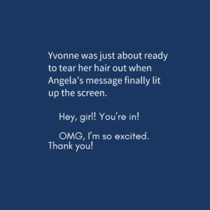
    If your characters are spending a lot of time communicating this way, you might want to use a clear visual cue to indicate a text message convo. Select a different font (a sans serif font helps to distinguish it from the rest of the copy while giving a nod to tech formatting) and set it off with indents. For example:

    tile showing text messages formatted with a different font and indents.

    Use formatting to indicate sent and received texts

    Think about how messages are displayed on your phone. The ones you send are aligned right and the ones you receive are aligned left. Some authors are choosing to replicate this format in their works, even placing them inside speech bubbles with dates and times for an authentic look. In this style, you might want to use names to indicate speakers, as you would in a play. For example:

    A tile showing two text messages aligned left and right

    Some authors – particularly young adult authors – might even like to work with a designer or illustrator to create a graphic treatment for texts.

    How to choose?

    Your choice of style to use will depend on a number of factors, including readability and budget.

    Some questions to ask yourself include:

    • Do you have long strings of text exchanges between characters?
    • Will you ever have more than two people in a text chat?
    • If you’re using names to discern who is sending the texts, how do you imagine them being read in an audio version?
    • What age group are you writing for?
    • Are you working with a designer/typesetter who can create a special design treatment for texts?
    • Is space an issue?
    • What’s your personal preference when reading this type of dialogue in fiction?

    If you’re only using the odd text here and there, italics might be all you need. But if text messages are a critical part of your characters’ dialogue, consider using a special treatment, even if it’s just a different font.

    You might like to try out a few different styles and see how they fit, and when you decide on one, ask your beta readers to give feedback on whether your treatment of text messages is clear and enjoyable to read.

    What about emojis?

    I love a smiley/winky/smirky face as much as the next millennial, but there are caveats to using these guys. Like fonts, emojis (that is, the little pictures, not the ones created with letters) are subject to copyright, so if you’re self-publishing, make sure to buy a licence or find a free version for your work. Also bear in mind that they won’t appear in colour in your printed book, which may lessen their visual appeal and impact.

    Another thing to consider is the possibility that they will date your book. Emojis are popular now but they may be considered cringe in a few years’ time, or their meaning could shift. It’s something to keep in mind if you’re concerned about your work’s longevity in the market.

    The verdict

    As long as you’re making text messages and who’s sending them clear to your reader, there’s no real right or wrong here. I lean towards using a different font or italics to indicate text messages in fiction and weaving in some dialogue tags and action beats to keep readers on top of who’s texting at all times. If you’re working with a copy editor, you can ask them if they can set up a special style in Word for text messages when working on your book to ensure you achieve both consistency and clarity. This will ensure they’re typeset differently to the rest of your text too.

    Ultimately, I love seeing creative ways of depicting technology in fiction and I’m excited to see how this evolves on the page. Futuristic novels that use not-yet-created technology? Even more fun!

    Want help formatting your book’s text messages? Get in touch for a sample edit.